Darrell Wolfe, Data & Systems Consultant, Topos Creative (DBA)
I simplify complicated geeky things. I am the one you call in when the systems, policies, and procedures need to be uprooted and rebuilt from scratch.

Skills: Excel, SQL, R, Python, Tableau, Power BI, GitHub, Cursor, Visual Studio Code, RStudio, AI Prompts (ChatGPT, Perplexity AI, Claude, Cursor, etc.) and Data Analyst Business Intelligence Analyst best practices.
Notable Projects:
Kootenai County Data Entry Solution: DataDev Toolkit
The DataDev Toolkit is a project to consolidate our tools. Over the last two years we built hundreds of Python automations to replace manual data-entry tasks, saving time, reducing stress, and eliminating errors while increasing accuracy. This project (in progress as of Aug 2025) is to consolidate those tools into a single tool that any clerk with no Python experience can utilize. It combines SQL, Python, and Tesseract OCR to make intelligent decisions behind the scenes ensuring accuracy of execution, while making it easy for an entry level clerk to utilize.

Kootenai County Building Permits Appraisal Dashboard
Permits are issued throughout the county by various entities in various formats. In the last two years we worked with the various entities in an effort to get usable data and formats to automate permit entry to county appraisers can evaluate changes to existing properties and building of new properties. Most data now comes in CSV or Excel, some still send individual PDFs. Built a Python program to automate the cleaning of the data, preparing it for import into the system, and other Python, SQL, Tesseract OCR programs to automate stages of post-entry data entry. Built Tableau to visualize data.


In collaboration with a team of fellow Geeks, transitioned a local county government office from file cabinets (actual file cabinets) to digital-first processes. Developed hundreds of new reports, revitalized existing reports, hunted for missing data, repaired over 30,000+ incorrect data entries, and built a suite of automation tools using a combination of Excel, Power Query, SQL, Macros, VBA, and Python. Reduced position overtime pay automating secretarial busywork, while simultaneously reducing errors.
As a Business Intelligence Officer for the Kootenai County Assessor's Office, I create many data reports and visualizations. These have been some of my most interesting and/or valaable to the office.


As a Business Intelligence Officer for the Kootenai County Assessor's Office, I create many data reports and visualizations. These have been some of my most interesting and/or valaable to the office.
- Kootenai County Tax Assessed Values for Website | Tableau Public
- Kootenai County Parcel Counts by GEO: GEOs | Tableau Public
- Kootenai County Improvement Types: ImprovementStats | Tableau Public
- Kootenai County Land Rates and Legends: Land Rates and Legends | Tableau Public
- Kootenai County KCAssessor_Homeowner's Exemption Search Tool | Tableau PublicEmbeded on the website: Homeowner's Exemption Search Tool | Kootenai County, ID
- Kootenai County Sales Ratios MarketAdjustments BI Version | Tableau Public

Personal Projects:
I've been busy at my day-job, but from time to time I like to explore the stories data is waiting to tell. Here are some data driven stories that I found interesting.- CO2 (kt) Worldwide (*Coursera Practice Data, Wolfe, Darrell) | Tableau Public
- FHFA, UAD, Appraised Values | Tableau Public
- UK Road Safety Data | Tableau Public
Coursera Work:
Coursework related to my Google Data Analytics Certificate- Capstone_Member vs Casual_Station_Usage | Tableau Public
- Coursera: Boba Tea Shop Ratings | Tableau Public
Connect with me work on:
LinkedInGitHub
Tableau Public


For Reference:

Values for Website | Tableau Public

Capstone_Member vs Casual_Station_Usage | Tableau Public


Coursera: Boba Tea Shop Ratings_Map | Tableau Public


Homeowner's Exemption Search Tool | Kootenai County, ID (kcgov.us)


UK Road Safety Data | Tableau Public
1. Cyclistic Membership Campaign | A Coursera Capstone Case-Study, Track_1,Case_study_1, Cyclistic-bike-share-analysis

In this fictitious example used as a Case Study, Lily Moreno (Director of Marketing) has asked my marketing analytics team to help analyze historical data for a marketing campaign. The Cyclistic finance analysts have already concluded that members are more profitable than casual riders and the Moreno is convinced that the company’s future success depends on maximizing memberships.
Moreno is asking three questions of her teams to “guide the future marketing program”:
- How do annual members and casual riders use Cyclistic bikes differently?
- Why would casual riders buy Cyclistic annual memberships?
- How can Cyclistic use digital media to influence casual riders to become members?
She’s asked for a detailed report clearly showing my findings and recommendations for point one.
Marketing Team Goal:
Design marketing strategies aimed at converting casual riders into annual members. In order to do that, however, the marketing analyst team needs to better understand how annual members and casual riders differ, why casual riders would buy a membership, and how digital media could affect their marketing tactics. Moreno and her team are interested in analyzing the Cyclistic historical bike trip data to identify trends.
Fictitious Board Presentation:
The following would be presented in Tableau (Link Here), starting from "The Business Task" and working right.Ladies and Gentlemen of the Board, the Finance Analysts have identified that annual members are more profitable than casual riders, our marketing team has taken the next step to analyze our historical data in order to develop a marketing strategy to maximize memberships.
Director Moreno has identified three key components:
Investigating how annual members and casual riders utilize Cyclistic bikes differently.Unearthing the reasons that might motivate casual riders to invest in Cyclistic annual memberships.
Exploring innovative ways to leverage digital media, aiming to convert casual riders into committed members.
With these actions, we intend to shape marketing strategies that resonate with our riders' preferences and patterns, increasing memberships enhancing profitability.
My task today is to address question number 1.
"How do members and casual riders use Cyclistic differently?"
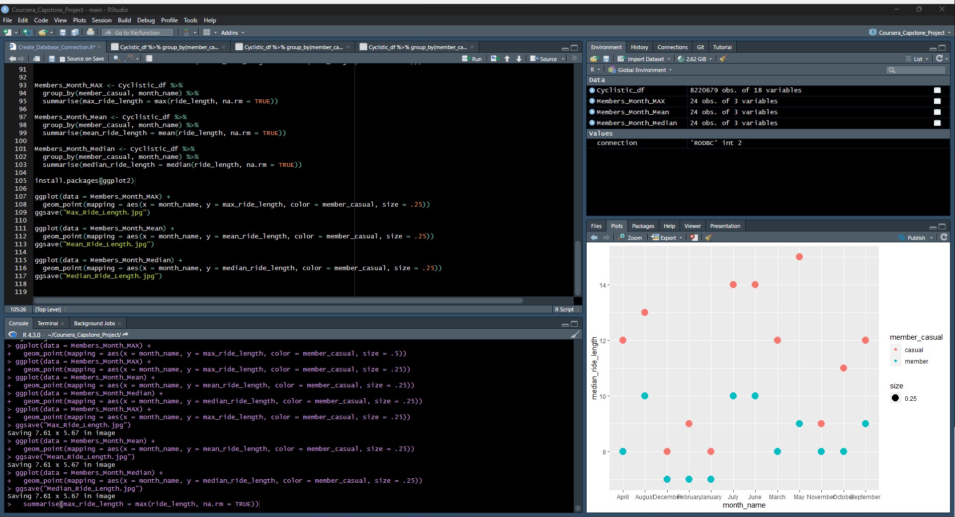
Summarizing the findings
The data for Cyclistic shows that there were over 8 million individual rides between January 2022 and July 2023, centering in in Chicago IL. Of that total, 60.50% were Member rides, riding 4.9 million rides over casual user's 3.2 million rides.Distance and time
Casual riders go farther given individual ride instances; however, Members ride farther in total miles cumulatively.Members mostly use stations inside the city but in affluent areas; whereas, casual riders use them near tourist locations, specifically near the water in Chicago.
Date and time
Members and casual riders follow a similar pattern of a slow increase in the morning, maxing at mid-day and decrease into the evening. However, Members are significantly more active than casual members between 6a and 8a.Members ride more often on weekdays vs Casual riders more often on weekends.
Members ride more often than Casual riders but for shorter distances, and their highest usage is in
Summer(June, July, and August), with a taper effect on either side, in Spring (May) and in Fall (September). That being said, members do continue to use the service in winter at a higher rate than casual members.
Extrapolating from these findings:
If Casual riders ride longer rides but Member riders make up far more total distance, then Member riders are riding far more often but for shorter distances.This means, we can target casual riders who fit the pattern of frequent shorter rides as a prime target for the campaign.
We should focus the ad campaign on the inner city regions, specifically in higher income areas.
Later, if we find this method of targeting casual riders who fit member patterns effective, we could expand the campaign to target new station areas that fit these patterns, or even develop new stations not currently used by members, but this would be a premature investment at this stage.


Tableau Stations Data


2. CO2 (kt) Worldwide (*Coursera Practice Data, Wolfe, Darrell)
During the Data Analytics courses, I had the opportunity to play with the CO2 dataset. I found it fascinating that data can be used to tell a story; however, it can be used to mislead or paint a misleading picture.
On one hand, CO2 Kilotons per Capita would make it seem the USA was doing less damage than some other nations.
However, when the data is sliced by CO2 Kilotons per Country, it is clear that the US is producing more total CO2 than any other country.
These tell different stories, and it helps to see these side-by-side.


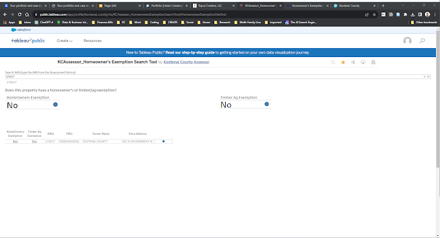
3. Kootenai County Assessor's Office - Exemption Lookup Tool - Tool vs Visualization
Tableau Public can be used as a tool, not just as as data visualization "report". The Assessor's Office needed a tool that property owners could use to self-serve lookup their property and see if their Homeowner's Exemption and/or Timber Exemption were in place. We first built the tool in Power BI but later decided to transition to Tableau Public. The Tableau Public tool is then embedded in the Assessor's Office website, to make it feel cohesively a part of the website (as opposed to a taking the user to a separate site). A property owners can use the county GIS site to look up their AIN and use this tool.
Examples: 175217 (no/no), 107763(yes/no), 147362 (no/yes)